Francis Pujols

Overview
Everything Benefits needed a brand-new Benefits Management Dashboard, to help businesses of all sizes streamline benefits management processes. The goal was to build an intuitive platform that enables employers and employees to access, manage, and analyze benefits data efficiently, while maintaining compliance with regulations and offering a delightful user experience.
The platform had to address key challenges such as fragmented data sources, manual processes, and outdated tools. The result? A product that empowers users, simplifies benefits tasks, and enhances decision-making through actionable insights.
Client:
Everything Benefits
My Role:
Product Designer
Service Provided:
Dashboard Design, Product Design
Focusing on goals
To design a solution that truly addressed user needs, I collaborated with a multidisciplinary team to gain a deep understanding of our customers, their challenges, and their goals. This involved diving into the real-world problems they faced and exploring ways we could help.
From our research, we discovered that customers had clear goals. They wanted an easy way to manage benefits enrollment, make updates, and handle compliance reporting. They also sought actionable insights to understand benefits usage and costs better. However, achieving these goals was not without challenges.
One major issue was fragmented data sources, which often led to manual input errors. Additionally, many customers lacked the tools to effectively visualize and act on their benefits data. These gaps created significant pain points. Processes like adding or updating employee records were time-consuming, and many users felt anxious about compliance risks and penalties due to incomplete or incorrect information.
These findings shaped our product strategy and helped us prioritize key features for the dashboard. By focusing on these real-world needs, we aimed to create a tool that made benefits management simpler and more reliable.
ideation
Going over the research findings and some workshop with the stakeholders give us a good idea of the features and functionalities required to address user needs. I started pulling together a list of those key functionalities that the user must have.
The user should be allowed to add, update, remove employees from the dashboard
Add employees dependents
Assign benefits to employees
Employees should be able to go through open enrollment
Employees should be able to modify their enrollment
Add new benefits to their list
Employees should be abale to visualize their enrollment at any time
Add/upload hours and wages
Task flows were created to represent each key scenario and later presented to the team to get feedback and collaborate. Must of those team members included the UX researcher, content designer and others.
Setting the design direction
I started to define the overall design direction by creating sketches and wireframes. I generated a stack of ideas about the arrangement of UI, functional and data elements. Starting broad, our vision began evolving into something tangible. A high-level design language, interaction and the app’s anatomy began to piece together. Those pieces were presented initially to the UX team and later presented to a brother audience to get initial design feedback. After receiving the approval from the stakeholders next step encompassed the creating o the final designs.
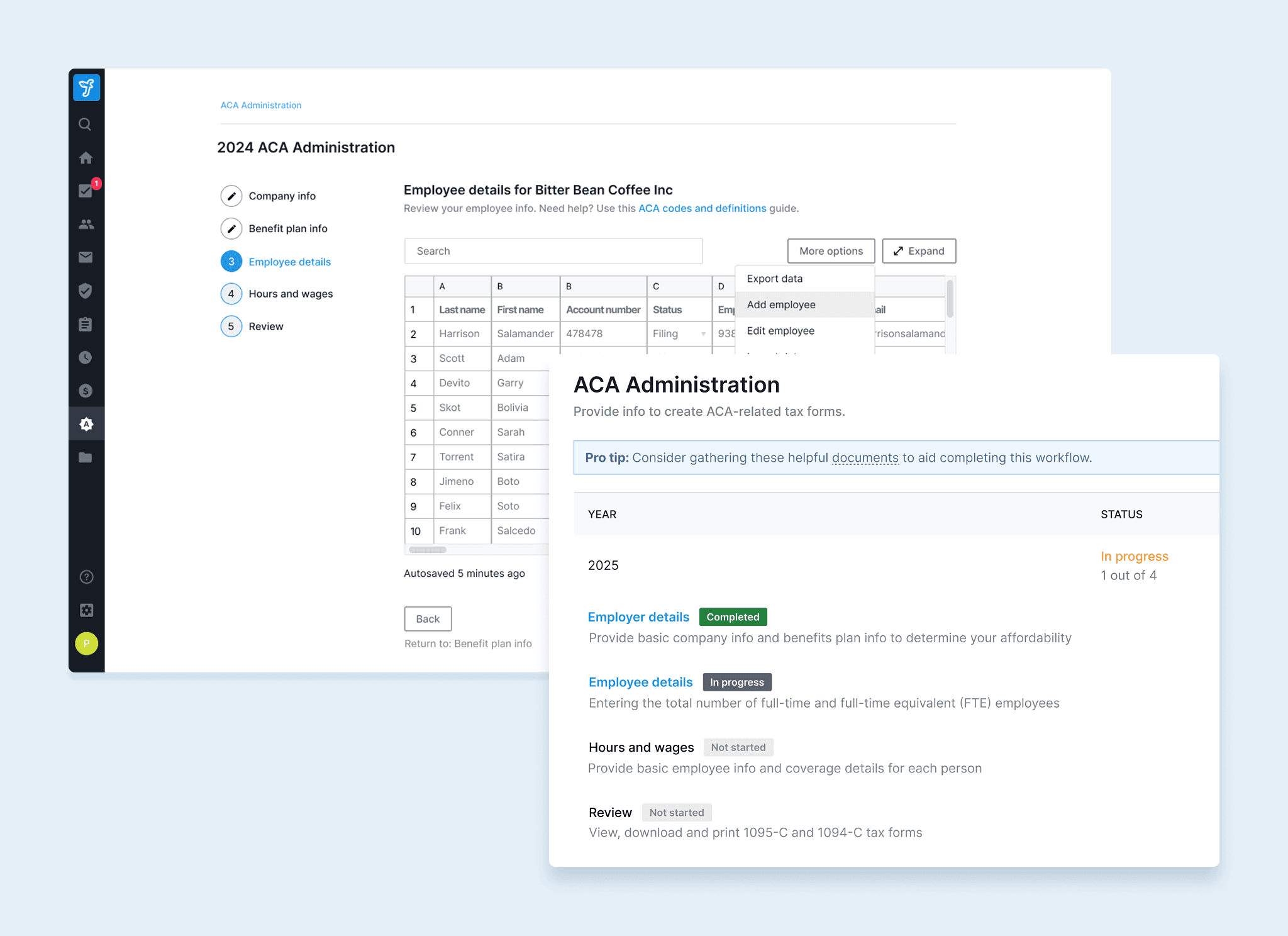
Designed with confidence
Following visual design best practices we started tu put all pieces together by creating our high fidelity designs.
Designed with confidence
This project taught us a lot about building for real people:
Listen to Users: Talking to users shaped a design that truly works for them.
Keep it Simple: Clarity and consistency make all the difference.
Iterate to Improve: Feedback helped refine and perfect the design.
Details Matter: Small tweaks, like icon labels, had a big impact.