Memento Usor (remember the user)
Overview
Joyclean started it’s services in 2017, during this period they have been using the same website to acquire and inform users about their services and benefits. Their impact in the cleaning service since then has been big enough for them to consider improvements in their online presence. That’s who we collaborated to come with a website that could dramatically improve their results by reducing loading time, improving retention and reducing number of request to their service team.
Client:
Joyclean
My Role:
Product Designer
Service Provided:
Web Design, UI/UX Design
Collecting requirements
Setting expectations was a crucial step on the process. We collaborated with the Product Team, Manager and other stakeholders to understand needs, requirements and the why behind the redesign needs.
Main goals:
Enhance navigation and information architecture
Reduce the number of request through the different contact points
Increase session duration on website
Increase conversion rate
Problems
There was a low conversation rate
Sessions durations were usually lower than 30 seconds
Increasing number of requests to the point of contacts
Time on task (Sign up)
Having clarity on the goals and problems set us for success so we decided that was a good time to start doing a deep analysis into the problem and confirm our hypothesis.
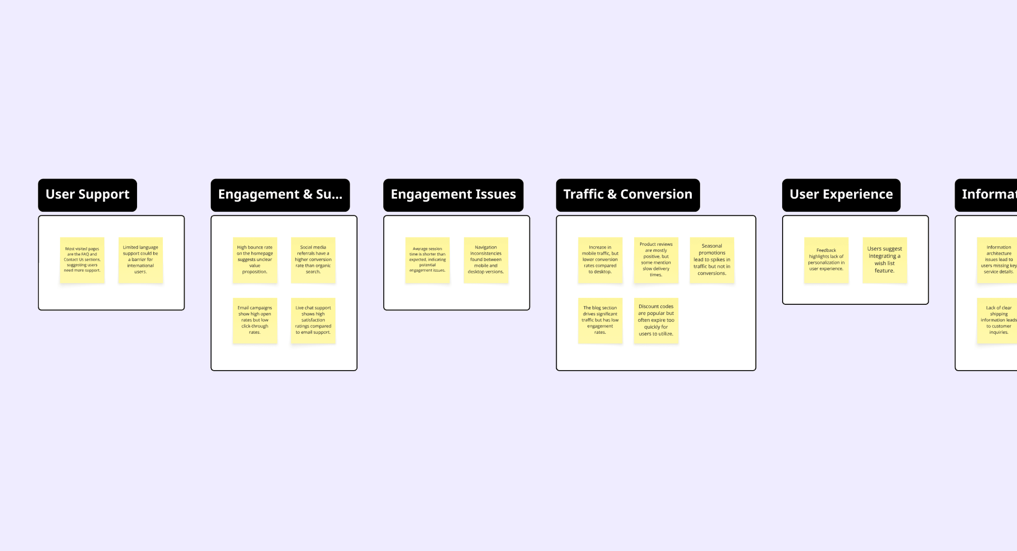
Affinity map
In collaboration with some members of the team, I took time to overlook the experience users had and I found really good insights trough while navigating the website looking for inconsistencies, information architecture issues and overall brakes of UX best practices.
To find out information users usage data we used Mixpanel. This gave us a lot of value information about the real needs and users problems. We uncovered details such as average session time, most visited pages, frustrations points in the flow and more.
Vision work
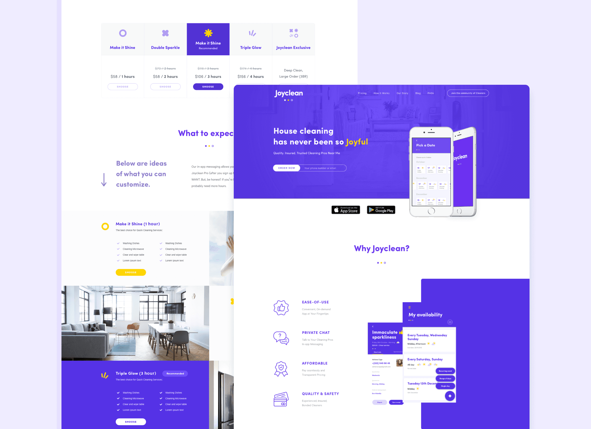
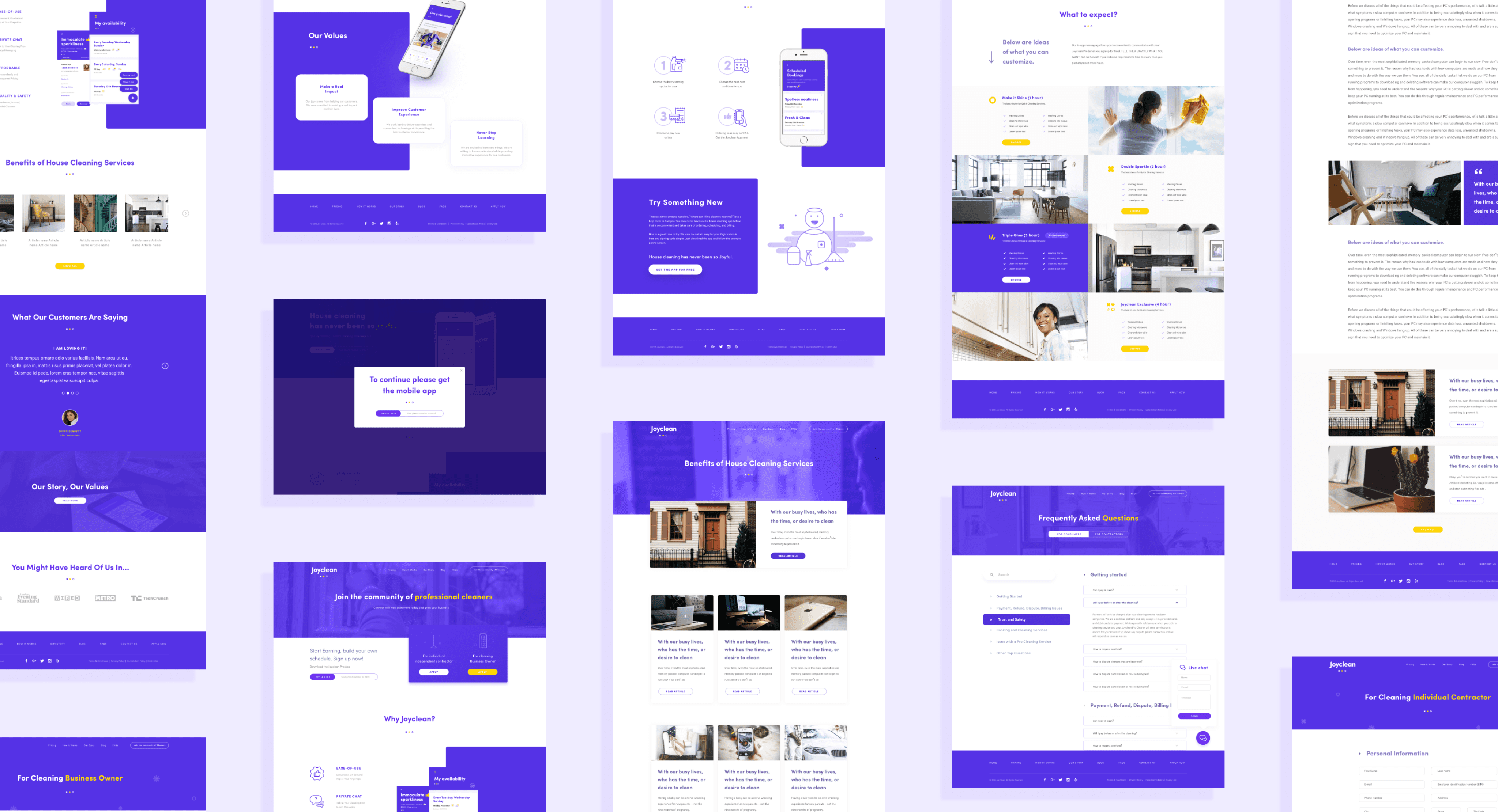
Through a collaborative approach, we outlined a strong direction that has set me up well to continue designing the site's overall flows and navigation. I initially shared rough sketches the team, and with each round of feedback, we progressed from these initial concepts to more polished wireframes, gradually refining and adding new features until we were happy with the results.
To speed up feedback, I uploaded each iteration—starting with initial sketches and moving through low-fidelity wireframes—into interactive InVision prototypes. This streamlined our review process, allowing us to iterate quickly and enhance each version more effectively.
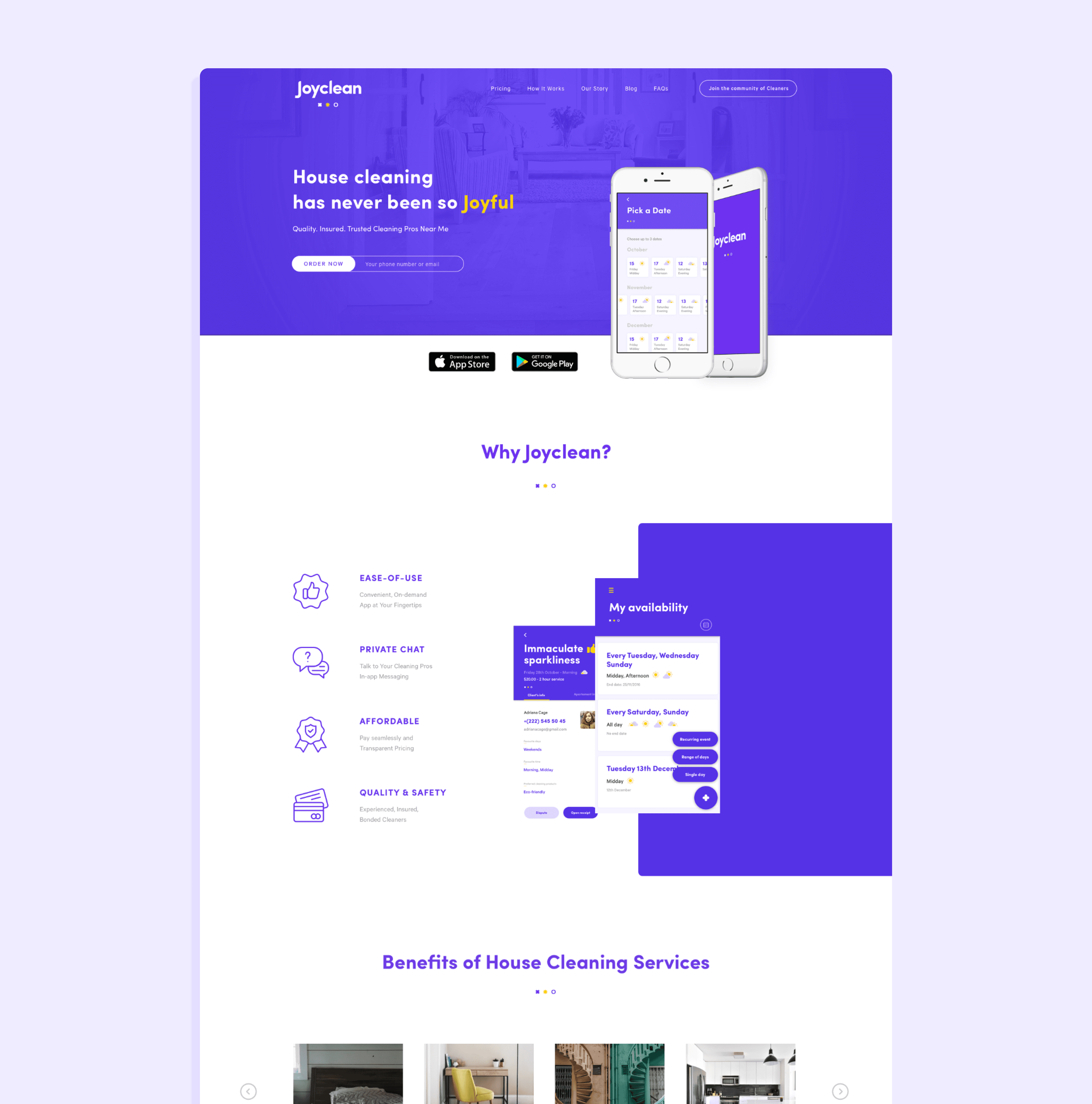
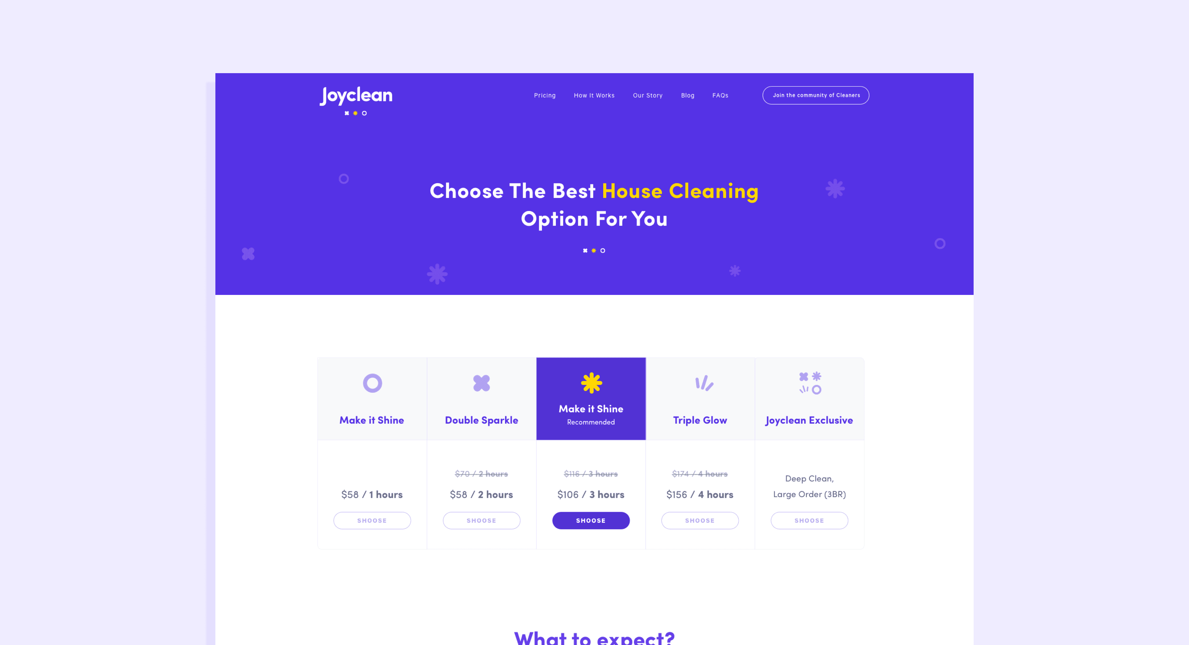
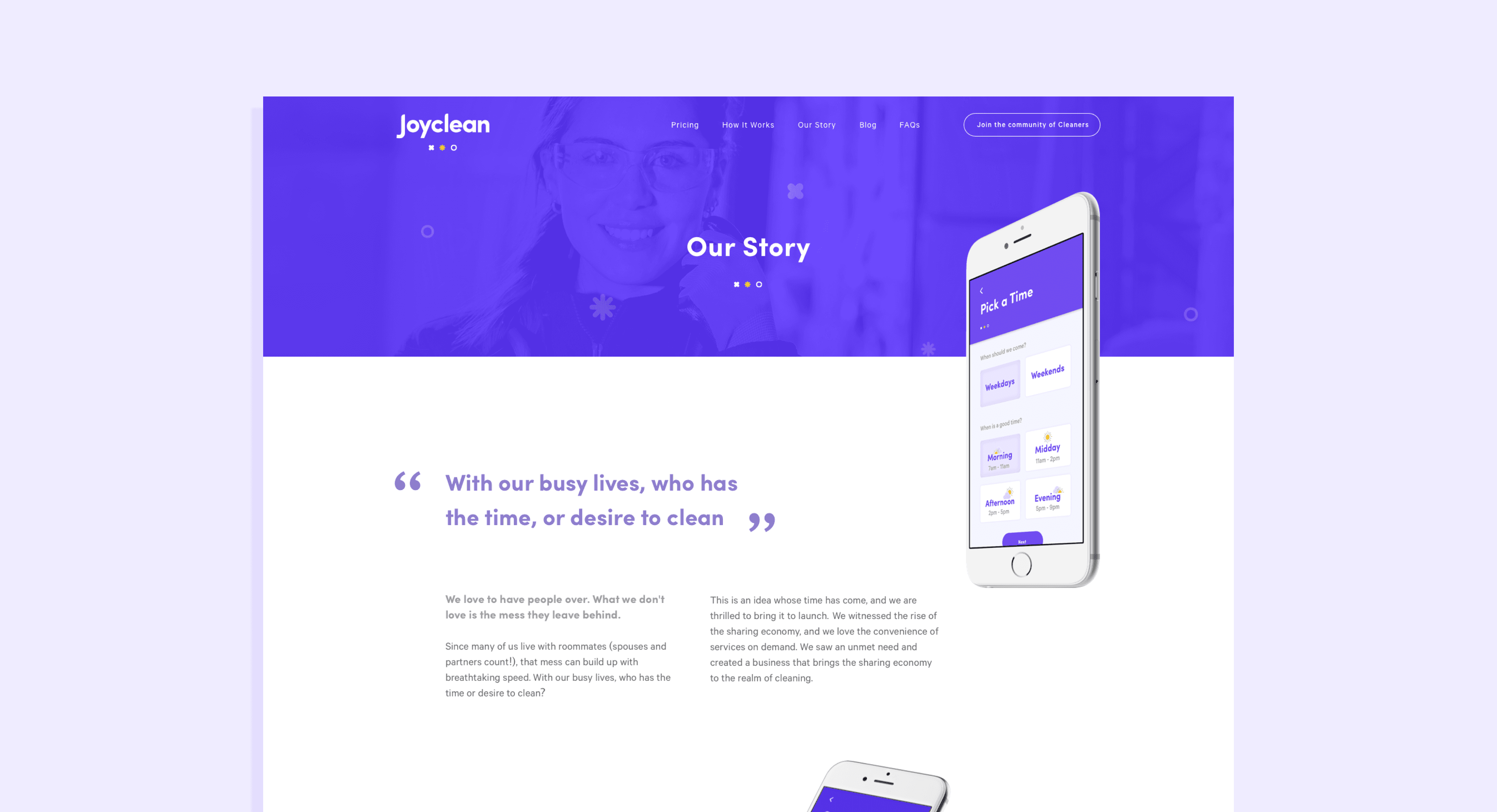
Design
Our goal was to convey a sense of cleanliness throughout the design, guiding every phase from moodboards to the final product. I dedicated significant time to researching inspiration across various aspects of the project—illustrations, interfaces, patterns, and interaction design—to ensure a cohesive and polished result.
Using Sketch, I transformed my initial sketches into high-fidelity wireframes, refining design elements and pushing patterns to their fullest potential. These wireframes then evolved into final mockups, which I shared with the team as an interactive prototype for feedback.
Following an iterative review process, the Development and SEO teams came together to begin coding and implementing strategies for optimal web positioning.
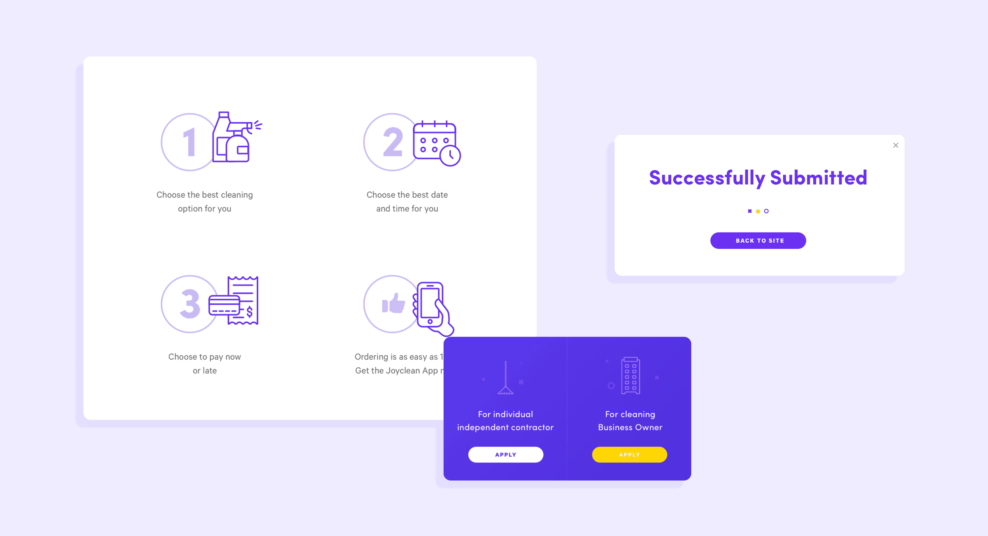
Icon, illustrations and animations
I used illustrator and After Effects to create stunning and cohesive icons, illustrations and animations. Most of them served as companion for text helping explain information in a more fun and attractive way.
Results
After about three months of testing with real users, we delivered a refreshed product with a significantly improved user experience and interface. Comparing the new version with the old, the results were outstanding.
We used Mixpanel to measure different KPIs this helped us to understand how well our new version solve the issues on the previous version of the website.
After about 5 months we were able to:
The conversion rate increased by about 15% - 20%
Session time increased to 2 to 3 times more than before
After enhancing the website’s SEO we were able to increase the number of visitors to more than 70%
The SEO team played a crucial role in driving traffic to the site. A well-designed product can go unnoticed without a solid SEO strategy, and their efforts ensured our work reached the right audience.