Hasta la vista, bad UX! - Arnold Schwarzenegger, Terminator 2
Background
In today’s fast-paced world, maintaining good health has become a priority for almost everyone. Gym subscriptions are on the rise, and so are apps that promise to help users lose or gain weight. However, there is a growing demand for apps tailored not only to general fitness goals but also to address specific health conditions through diet.
This is where Safecals steps in.
Diet has the potential to dramatically influence health, either positively or negatively. Safecals combines the power of personalized diet plans to achieve weight goals while addressing specific medical concerns, creating a unique value proposition.
Client:
Safecals
My Role:
Product Designer, Visual Designer
Service Provided:
App Design, Visual Design,
User Research
Challenge
Developing an app that positions itself as a tool for both health improvement and illness management came with its own set of challenges:
Perception & Trust: Selling an app as a health improvement tool requires immense credibility. We needed to ensure that Safecals was perceived as trustworthy, backed by qualified professionals.
Accessibility: The app needed to be intuitive and user-friendly for people from diverse age groups, tech skills, and health backgrounds.
Customizability: Users needed to feel in control of their health goals, whether it’s losing or gaining weight or managing a health condition.
Balance Between General and Specific Goals: Merging healing-focused diets with general fitness goals without making the app overly complex.
To address these challenges, the app needed to focus on three core principles:
Speed and simplicity in user interaction.
Empowerment through customization and control over goals.
Transparency about the expertise behind the recommendations.


Solution
As the Lead Product Designer for this project, I collaborated with stakeholders, designers, and developers to build an MVP that was user-centric, credible, and effective. Here’s how the process unfolded:
Research
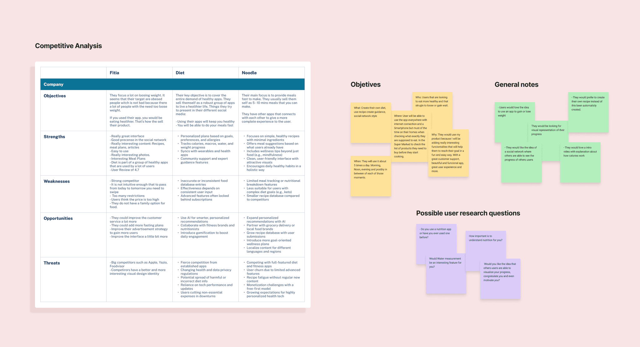
To ensure Safecals would address real user needs and stand out in the market, we conducted thorough research. Here are the findings from each category:
User Interviews
We conducted interviews with over 50 potential users across various demographics, including fitness enthusiasts, individuals managing health conditions, and those new to diet-focused apps.
Key findings:
Desire for Simplicity: Most users found existing apps too complex and wanted a straightforward way to set goals and get personalized recommendations.
Emotional Challenges: Many users expressed frustration with inconsistent progress and needed motivational tools, like reminders or positive feedback.
Medical Trust: Users managing health conditions were hesitant to trust generic advice and prioritized apps backed by credible professionals.
We analyzed apps like MyFitnessPal and Noom, finding gaps in medical diet support and overly complex interfaces. To address this, we collaborated with nutritionists and doctors to create Safecals, offering personalized, medically-backed advice with a user-friendly design.
Defining the user journey
To ensure the app meets diverse user needs, we outlined key user stories based on typical actions and goals. These stories guided our design and development process to create an intuitive and functional experience.
User flows and wireframes
To ensure a seamless and intuitive user experience, we created detailed user flows and wireframes. These helped us visualize how users would navigate through the app and interact with different features. Below are the key user flows and their associated wireframes.
Wireframes were presented to stakeholders. We wanted to make sure the designs proposed were inline with the business expectations.


Early testing
We decided to start conducting early testing with 10 Future final users. The main objective was to access users perspective on the product, concerns and check on how easy is for yours to complete each task.
Key Insights:
Users found the onboarding clear and appreciated the medical backing.
Some had trouble customizing meals and wanted more guidance and visual feedback.
There was a strong interest in more visual summaries for daily progress and nutrition.
These findings helped us quickly improve usability and prioritize key features before moving into full development.
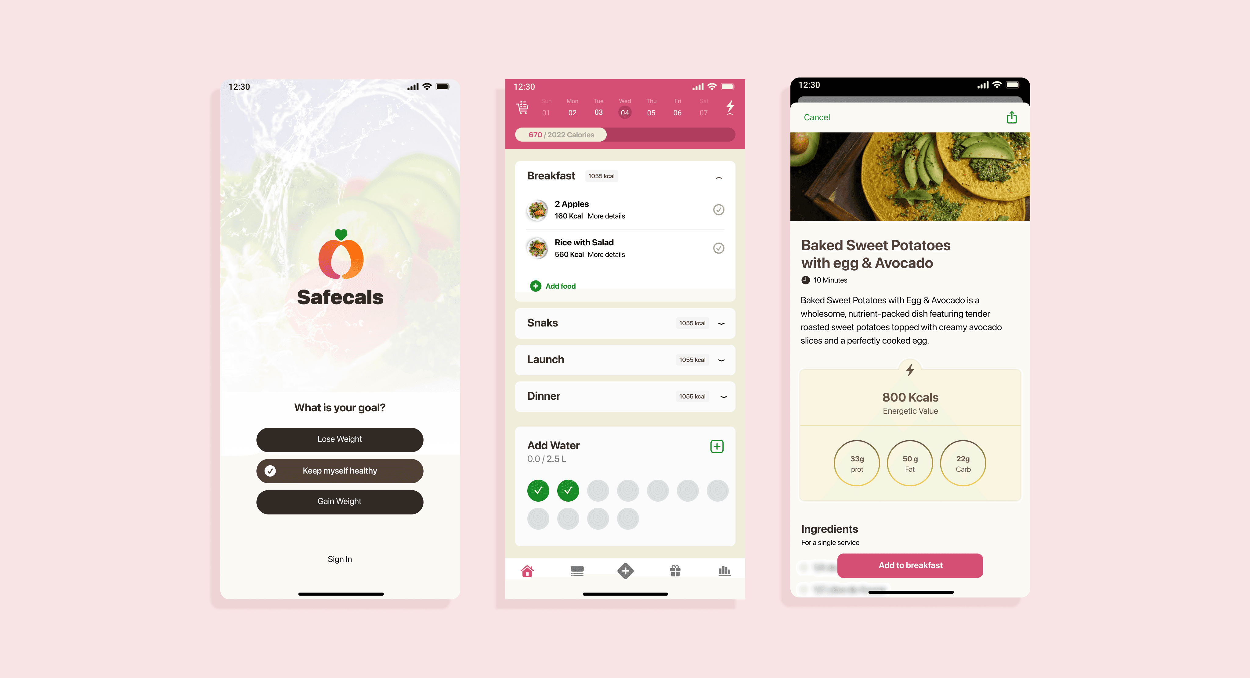
Design
With users insights we were more confident to continue into our Design phase. I collaborated on all aspects of the design cycle from creating the Visual Identity to coming up with the final UI Design. Moldboards were created to showcase our direction to stakeholders.

Testing
We created a high-fidelity prototype to begin testing with five users. Overall, the usability was solid across most scenarios we evaluated. However, we did uncover a few areas that needed improvement:
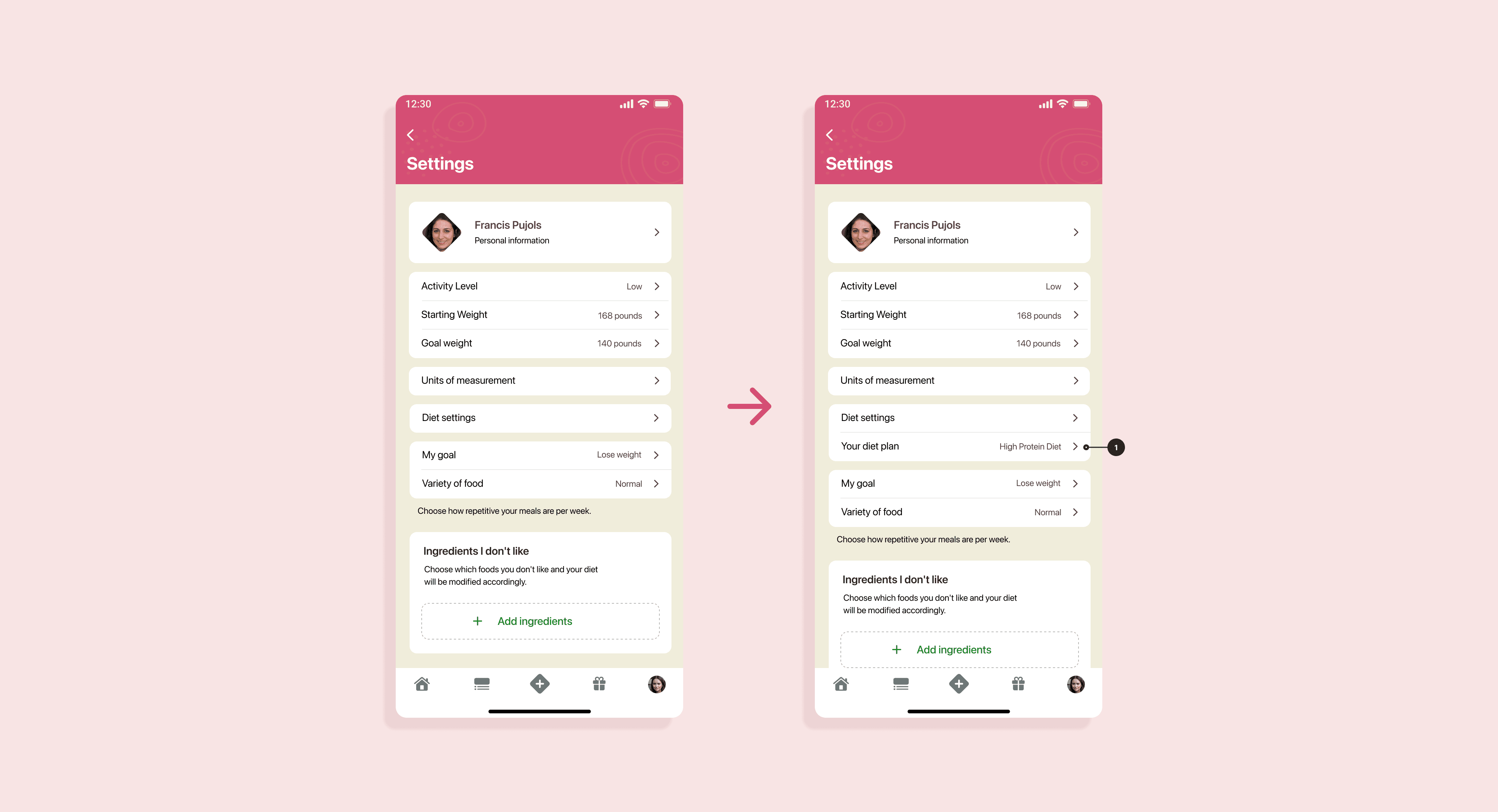
1. Changing the Diet Plan
Users were able to find the option to change their diet plan, but it took longer than expected and came with noticeable hesitation. Although this option was accessible both from the Home screen and the Settings, users consistently navigated to Settings, even though it was just a scroll away on the Home screen. To make it more intuitive, we reorganized the Settings page, moving this feature two levels up in the navigation for better visibility.
2. Understanding Calorie Information
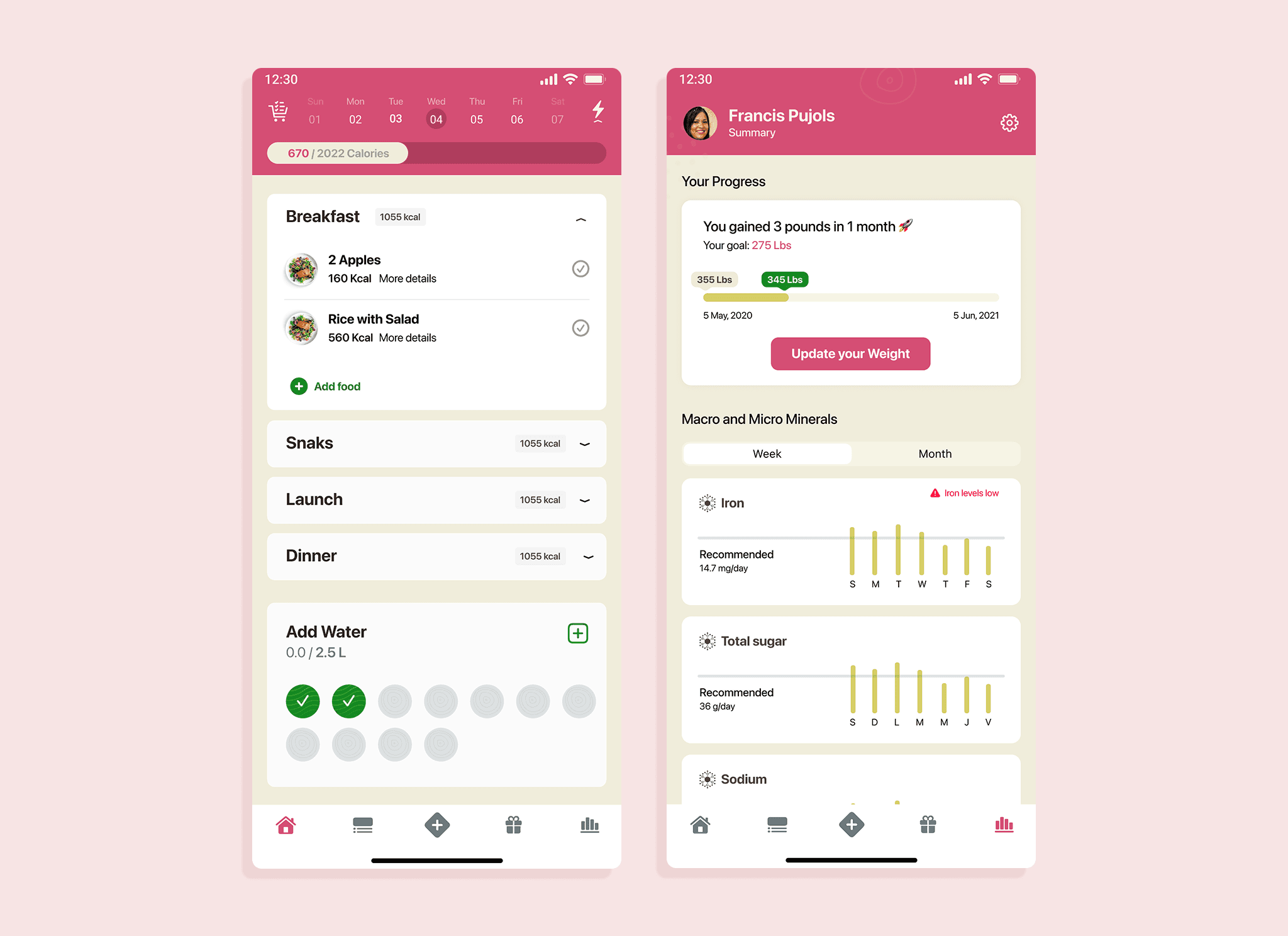
Most users clearly understood how many calories they had left, but they were unsure about how many they had already consumed. Based on this insight, we decided to show more detailed calorie data, specifically, how much they’ve eaten so far and the projected total by the end of the day. Interestingly, the “calories left” metric was seen as less important, so we chose not to emphasize it further.
3. Marking a Meal as Taken
We initially used an iOS standard swipe gesture to mark a meal as taken, where users had to swipe left to reveal the option. Testing revealed that this wasn't intuitive enough. To simplify the experience, we switched to always displaying a visible "Mark as taken" button.
4. Navigating to Settings
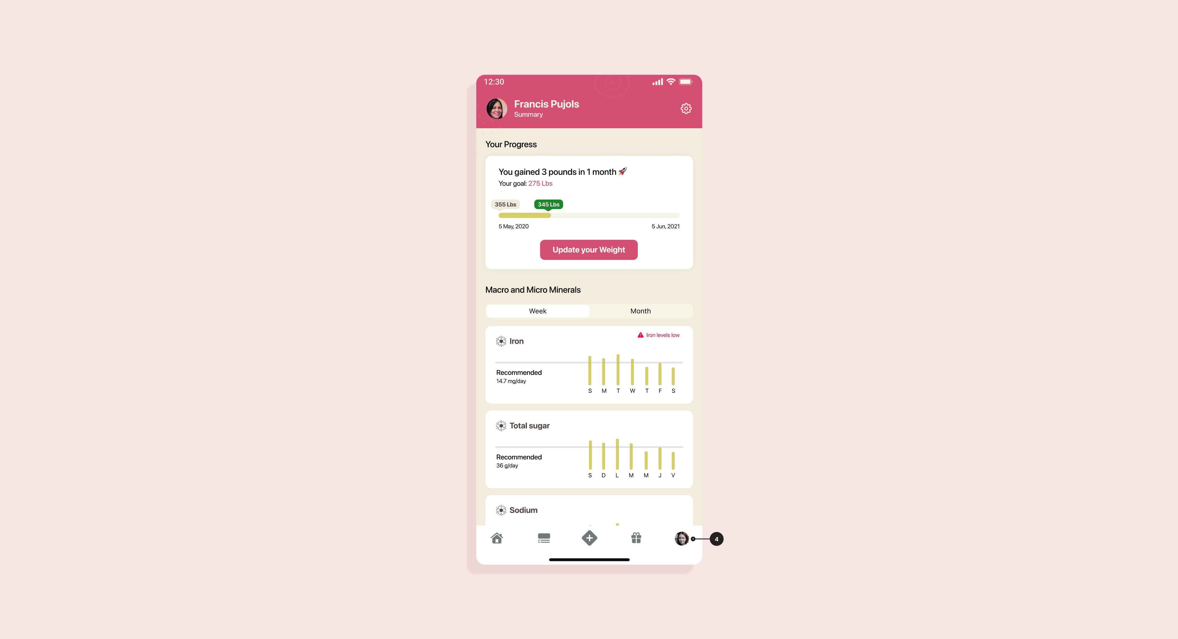
Users consistently struggled to find the Settings page, which was buried in third-level navigation. Rather than bury it further or keep it hidden, we replaced the generic icon with a profile picture. This follows a common app pattern, making it easier for users to associate the icon with both their profile and settings.
Learnings
One of the biggest things we learned was that people just want something simple and trustworthy. Knowing the app was backed by real health experts made users feel safe, but they still needed clear steps and easy to use features to stay motivated. Personal touches, like showing their progress and letting them adjust things to fit their lifestyle, made a huge difference.
