With great Design Thinking comes great UX - Uncle Ben, Spiderman

Overview
As a Senior Product Designer at Paychex, I led the end-to-end design of a self-service feature that enables administrators to manage insurance policies more effectively, reducing service team dependency and reducing the risk of policy compliance issues.
Paychex provides payroll, benefits, and worker’s comp services to thousands of businesses. However, a critical gap existed: no self-service solution for resolving policy issues such as coverage mismatches, billing preferences, or regulatory changes.
This led to:
A surge in support tickets
Risk of financial penalties due to unaddressed compliance issues
Poor user satisfaction
Client:
Paychex
My Role:
Product Designer
Service Provided:
Product Design, Dashboard Design, User Research
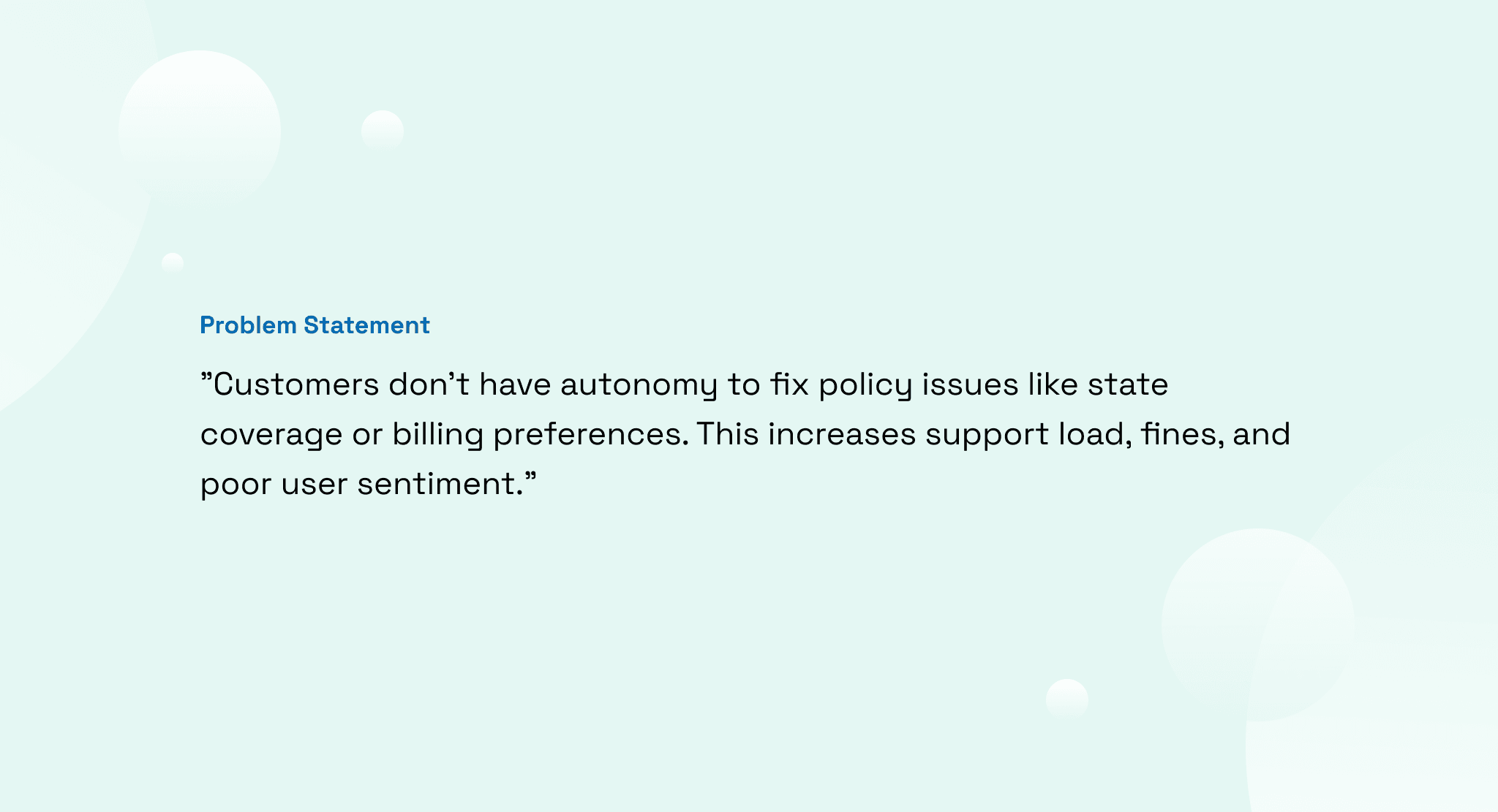
Problem Statement
"Customers don’t have autonomy to fix policy issues like state coverage or billing preferences. This increases support load, fines, and poor user sentiment."
Key Issues:
No alerts for policy issues.
Admins must contact support for every change.
Resolution time is slow, and error-prone.
Frustration for users and increased cost for the business.
Objectives
To solve this, I set some goals in collaboration with some key team members:
Investigate users’ pain points and internal workflows.
Design an intuitive self-service system.
Decrease service ticket volume by at least 40%.
Provide real-time alerts and issue resolution.
Ensure accessibility and compliance for all users.
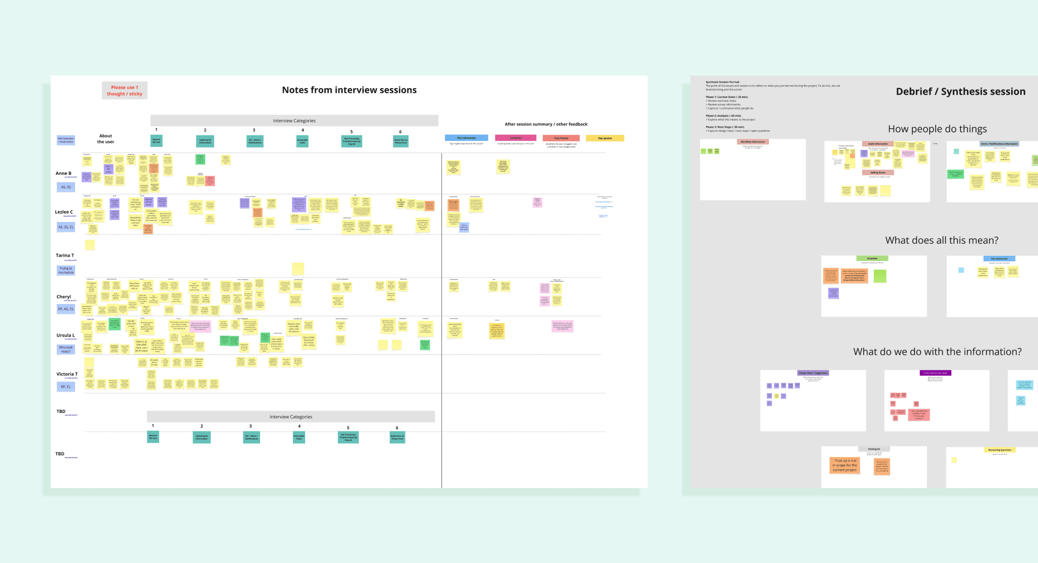
Research
It is always crucial to learn more about users pain points and desires before we start designing the specific requirements for our new feature. I created the research plan and reviewed it with other team members, specially the UX researcher.
Methodology:
6 User Interviews (Paychex Admins)
Affinity Mapping of pain points and opportunities
Workshop to review insights and brainstorm
Key Insights:
Users highlighted the importance of receiving notifications of the issues to resolve through email
Common requests: add/remove state, switch to direct bill, cancel policy, or decline coverage.
Some of them mention how relevant is to share the alerts and notifications with their leads
It usually takes them longer than it should to fix issues with their policies due to busy schedule.
Service reps spend 30–40% of time handling these repetitive tasks.
Personas
Sarah | HR Director | 300-employee company
Needs fast, audit-compliant tools to resolve urgent issues herself. Has limited time and needs guidance through complex terms.
Derrick | Small Business Owner | 12 employees
Manages HR himself and hates calling support. Wants visibility and trust in the system.
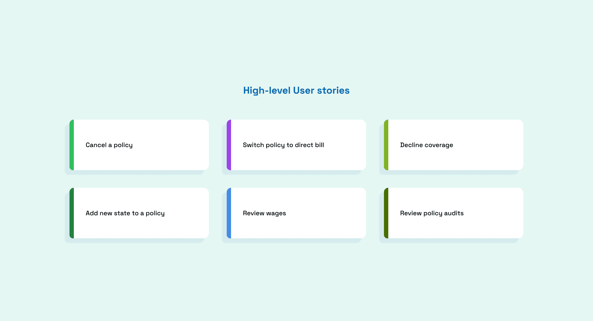

User Stories & Requirements
We had an hypothesis of the possible functionality we would need for this project. Through research we were able to get valuable insights that helped us to confirmed our assumptions and also come up with other solutions to satisfy their needs.
Here some of the must reverent high-level solutions we would address for this first version of the Self-service enhancements project.
Cancel a policy
Switch policy to direct billing
Decline coverage in specific states
Add new states to an existing policy
Review Wages (Based on research)
Review policy audits (Based on research)
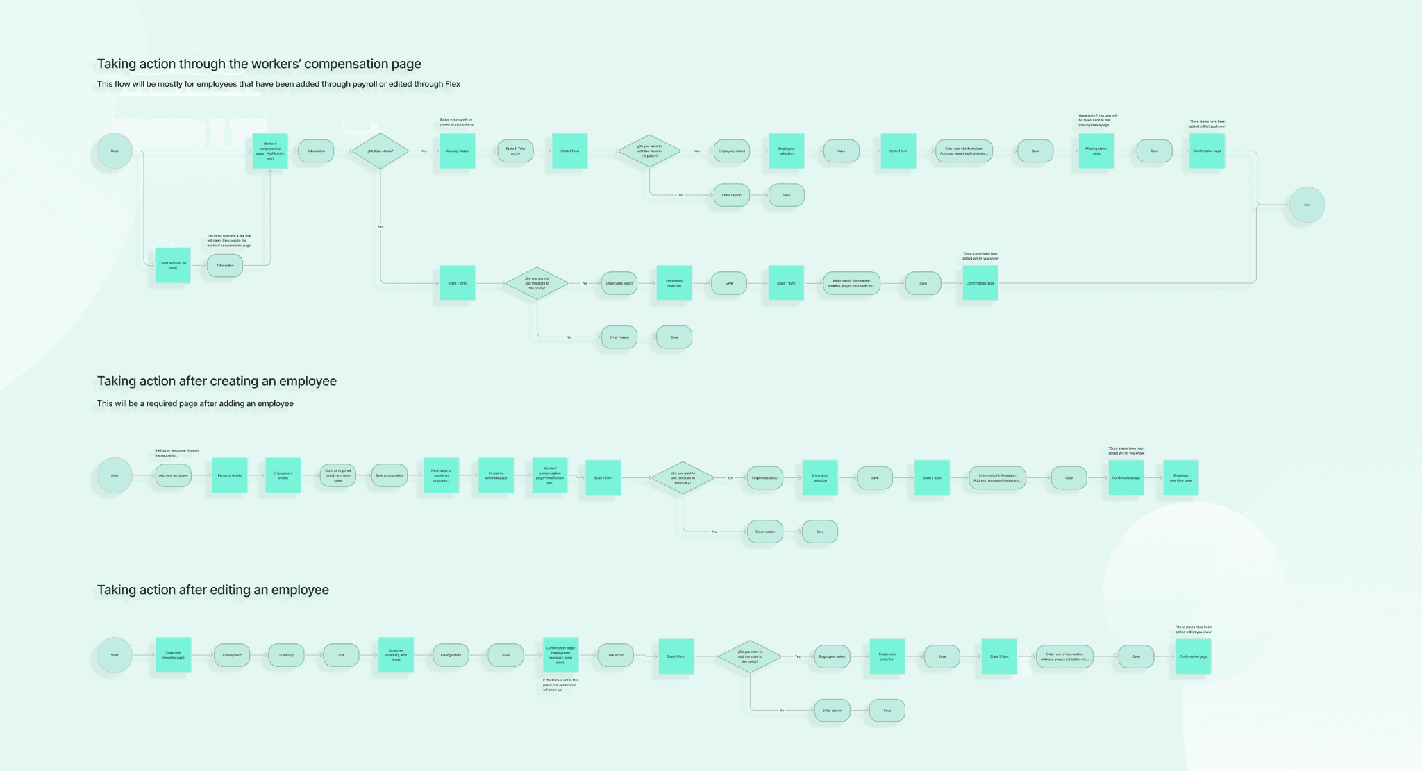
User Flows
Creating the users flows was a challenging process that allowed me to see all the different User stories in a visually and detailed diagram. They helped me and the team to get a good perspective on each of the solutions we were planning to build.
Wireframes & Iteration
We started with low-fidelity sketches and moved to high-fidelity clickable prototypes using Figma. Wireframes were presented to the team for feedback and iterated based on that. Worked closely with the Product Owner to make sure the deliverables were aligned with the business expectations.


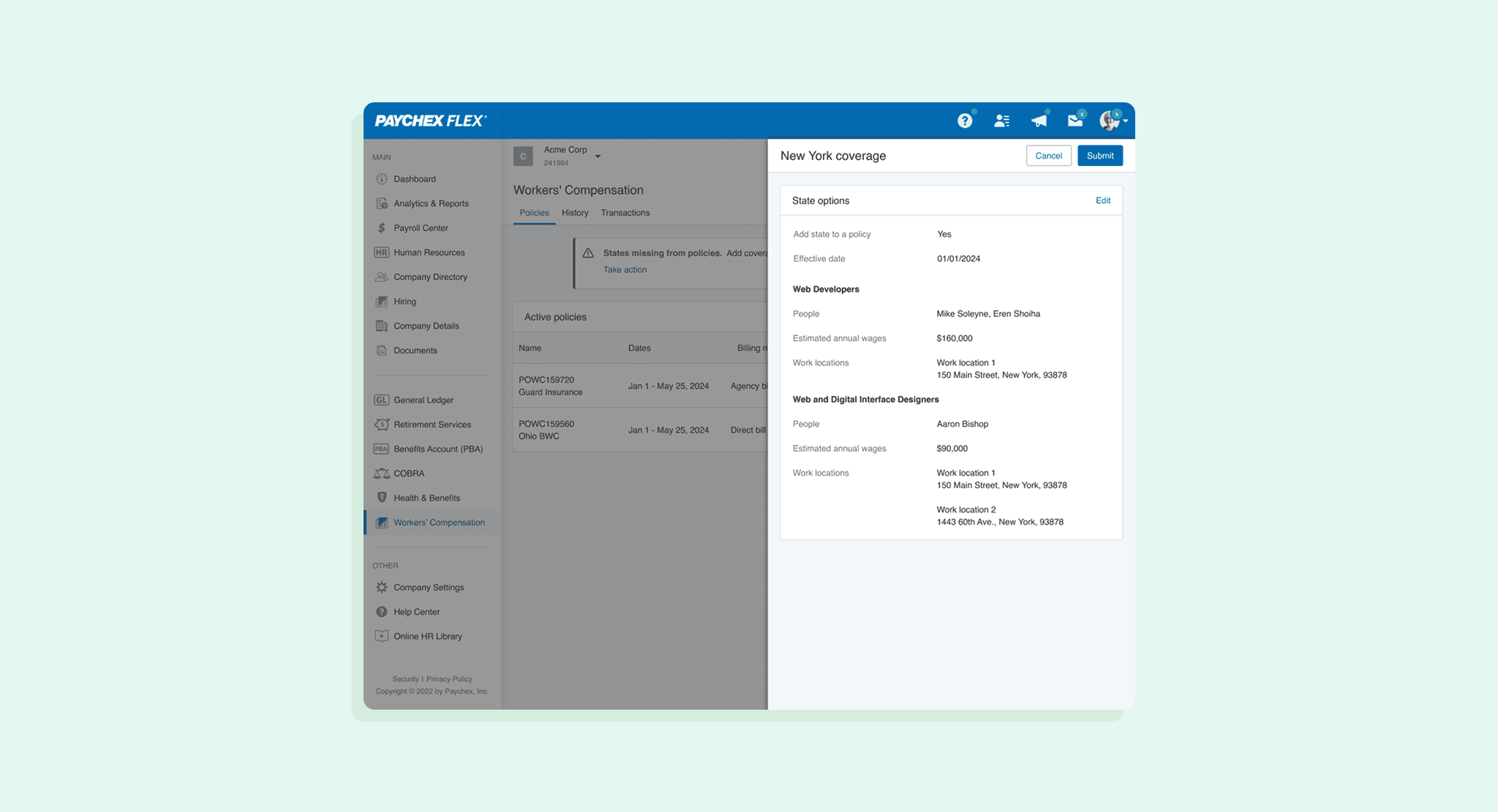

Design
Following universal design principles and Paychex Design standards I was able to start putting converting wireframes into high-fidelity designs. Those were later presented to the whole team to make sure it was in alignment with all the stakeholders expectactions. We took the next considerations:
I complied with WCAG 2.1 AA accessibility standards
I used the Paychex Design System to build each of the screens
I kept a collaborative approach with other team members, such as the PO, the Content Designers, and others.


Testing & Iteration
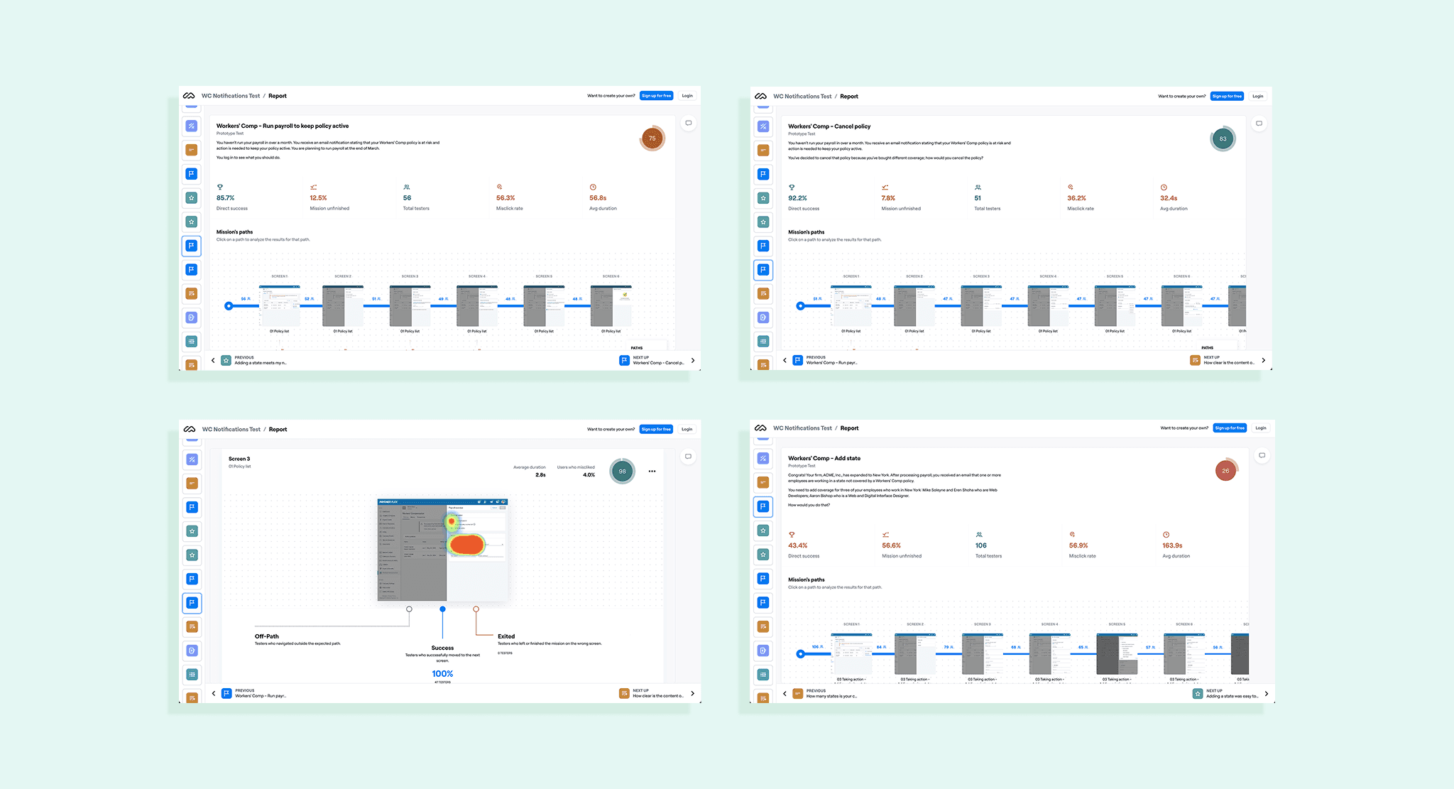
Once our designs were reviewed by all the stakeholders and there was a consensus, we moved into conducting user testing. A few rounds took place through moderated and unmoderated testing. The first round was conducted through the Maze platform. I created the testing plan in collaboration with the UX researcher, that included the questions for each scenario, objectives, background and more.
Unmoderated testing
We used Maze to create the prototype and finally get it in front of more than 100+ users per round.
We used Flex notification system to share the testing requests with participants
Moderated testing
We created the prototypes using Figma before getting them in front of 7 users per round
Users were contacted directly to ask for participation
We used Zoom for each call
Results:
93% task completion rate.
80% of users said they’d use this feature monthly.
Some usability issues were found and eventually iterated
Some of the issues we found:
When adding a state to a policy, when adding more than 1 jobs, they struggled to find the “Add job button”
Users expected to find the Policies audit statements in Analytics and reports. Going over the section we had it was usually the second try of users.
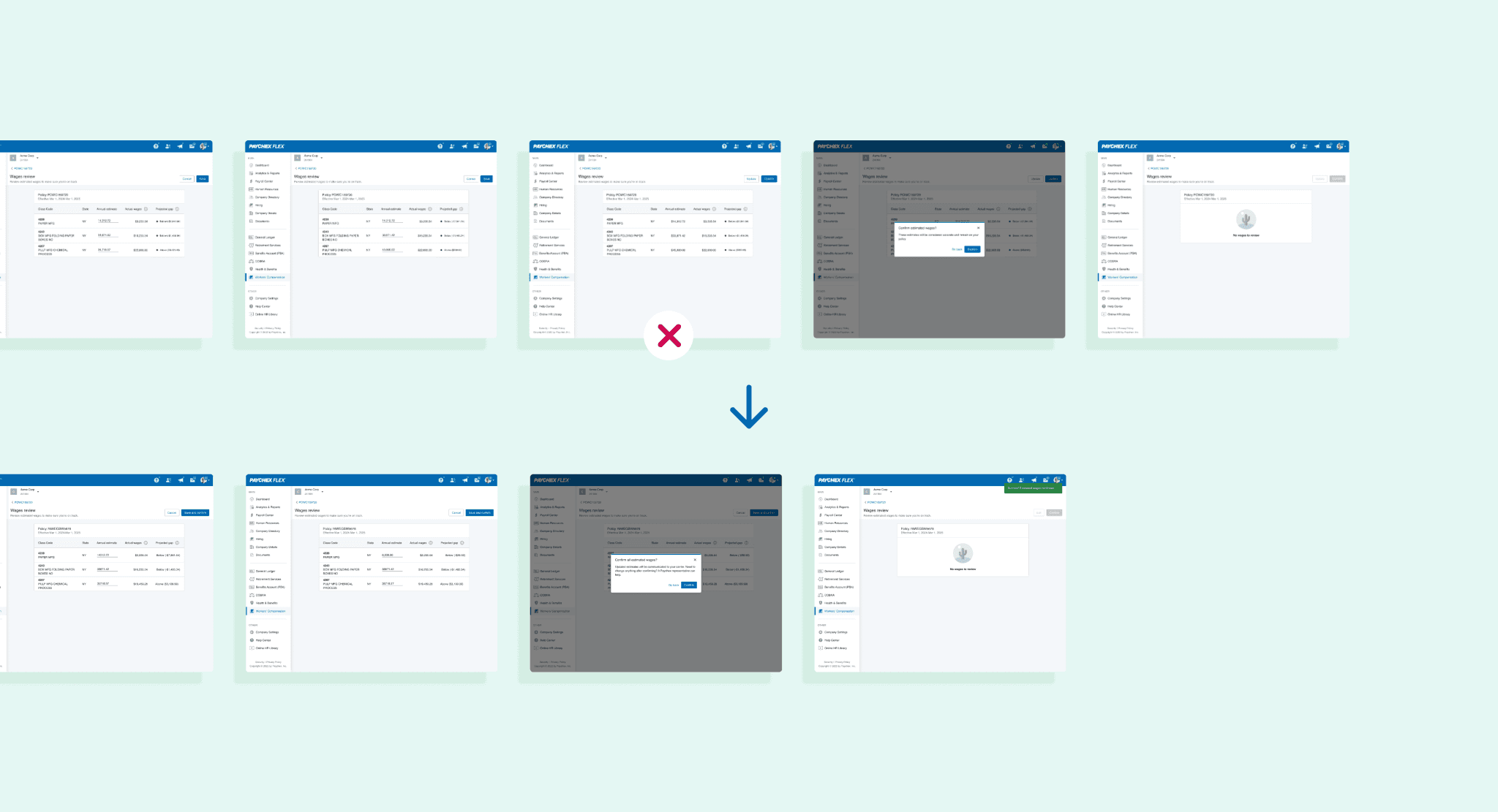
In one of the flows, users were asked to first save their changes, then click "Confirm," and finally confirm again in a modal dialog. However, users expected that clicking "Save" would immediately trigger the confirmation modal, and that clicking "Confirm" within it would complete the entire process.
Interesting finding:
One of the scenarios involved addressing a policy related issue. To let the users know about the issue we used email, push notifications, and a banner alert. During testing, the banner alert proved ineffective. Users often overlooked it and took several seconds to locate it. However, once they did, the interaction flow proceeded smoothly.
To resolve the visibility problem, we implemented a completely new approach: we integrated the alert directly into the policy list table. This change significantly improved visibility. Every user was able to immediately identify the alert and begin the process without hesitation.
This experience served as a strong reminder of how easily users can overlook traditional alerts or notifications, especially when they’re positioned outside of a task’s primary context.

Developer Handoff
We used a collaboration approach through the entire project lifecycle, this included also developers to make sure our designs were double. Feedback from them was received during meetings and implemented when necessary.
In Figma I made sure all the designs were properly documented before sharing with devs. I added dev notes, share necessary assets and keep a close look to each UX-QA ticket that was assigned to me.
Outcomes & Impact
47% reduction in service tickets within 3 months. Info provided by the service team.
Users can now resolve most policy issues in under 5 minutes.
We improved user experience by not forcing them to make direct calls to the customer service team.
I did a lot of new friends
Reflections
This is a great example of how we can meet both business goals and user needs. When we help users with their problems, we often make things easier for the business too. On every project, especially this one, I’ve learned new skills and seen how important teamwork really is.